
Eeken Footwear
Client: House of Paragon
Agency: Dentsu Webchutney, Bangalore, India
Year: 2018-19
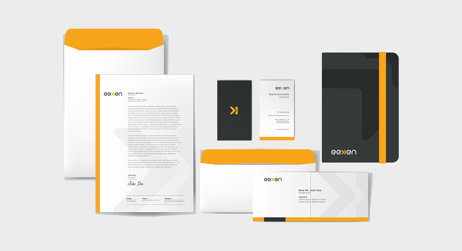
BRANDING/PACKAGING
Eeken is the newest fashion/lifestyle brand from the house of Paragon. It launched recently with a range of casual footwear for men and women who love to live every day like it’s the weekend. The name ‘Eeken’ comes, quite literally, from the middle of the ‘weekend’. The brand’s offerings have been made to suit a young, fun, active audience that’s always on the lookout for the next high that life will provide. Frustrated by routine, they yearn for the moments that they can make truly memorable in their own way.

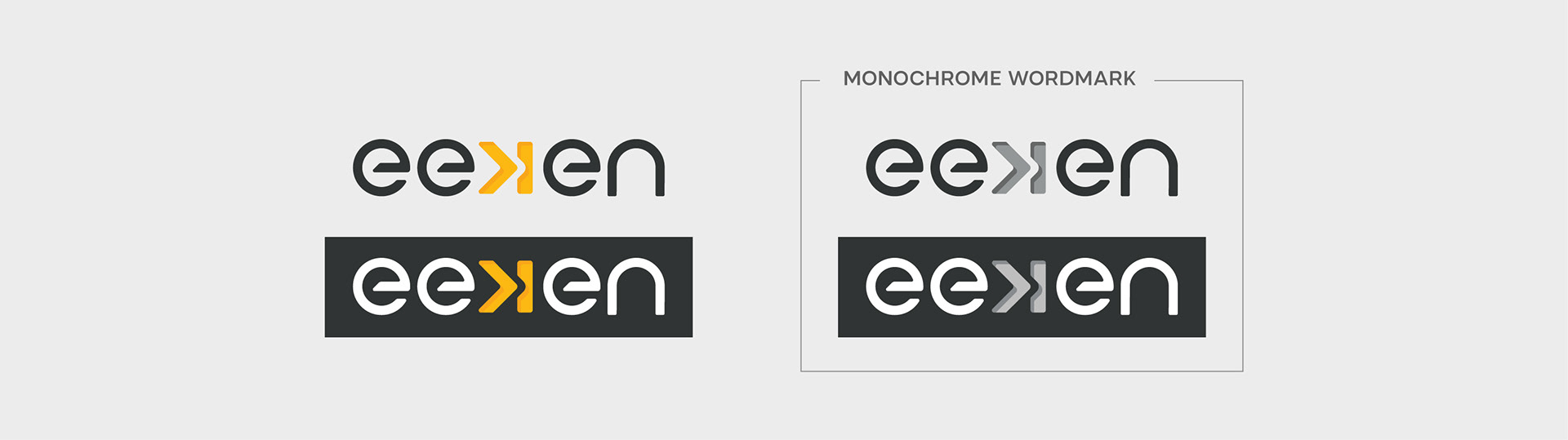
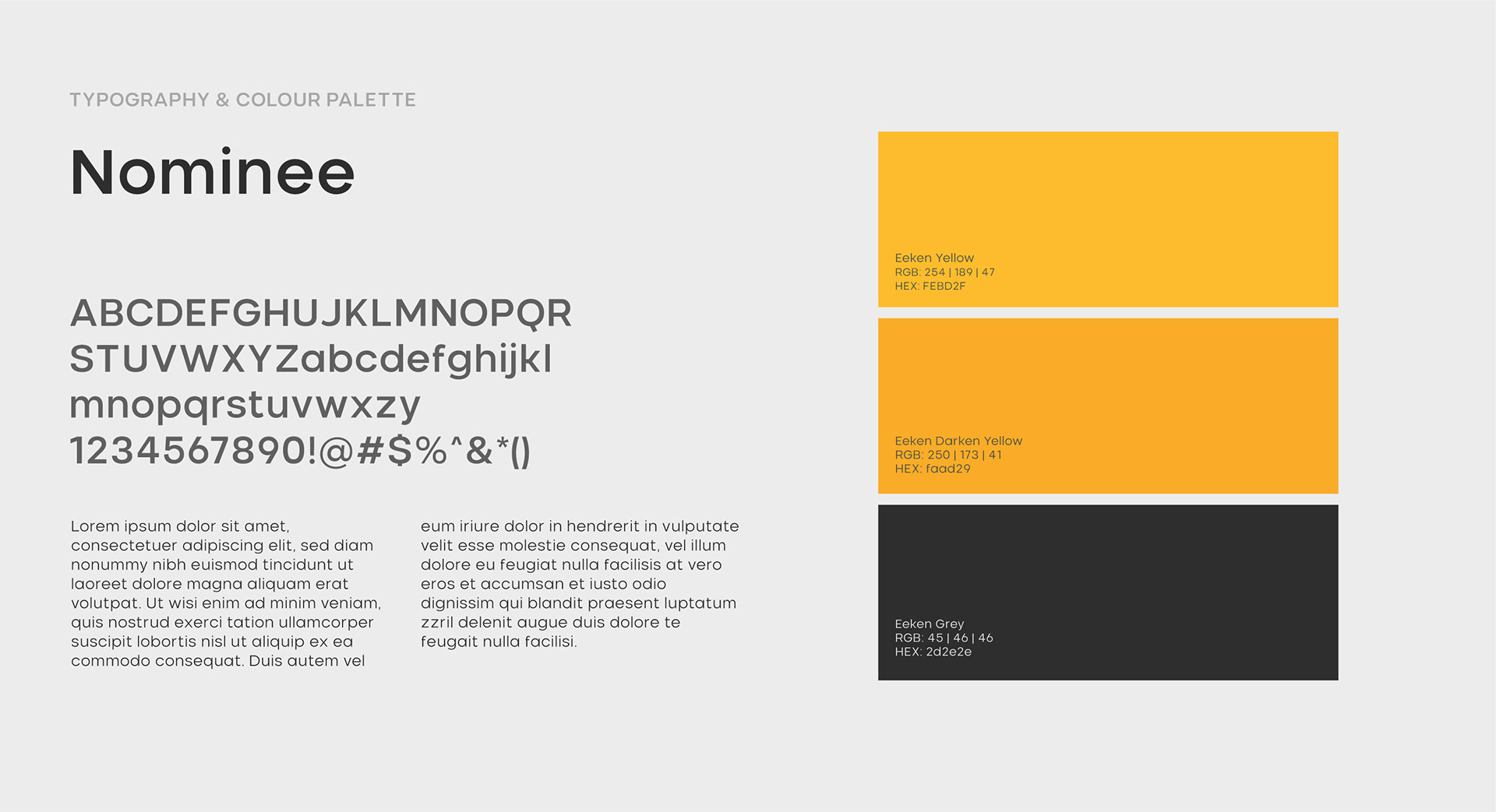
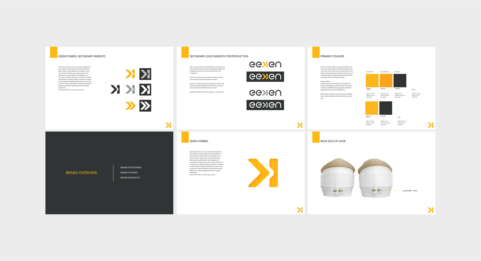
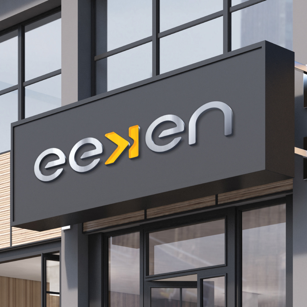
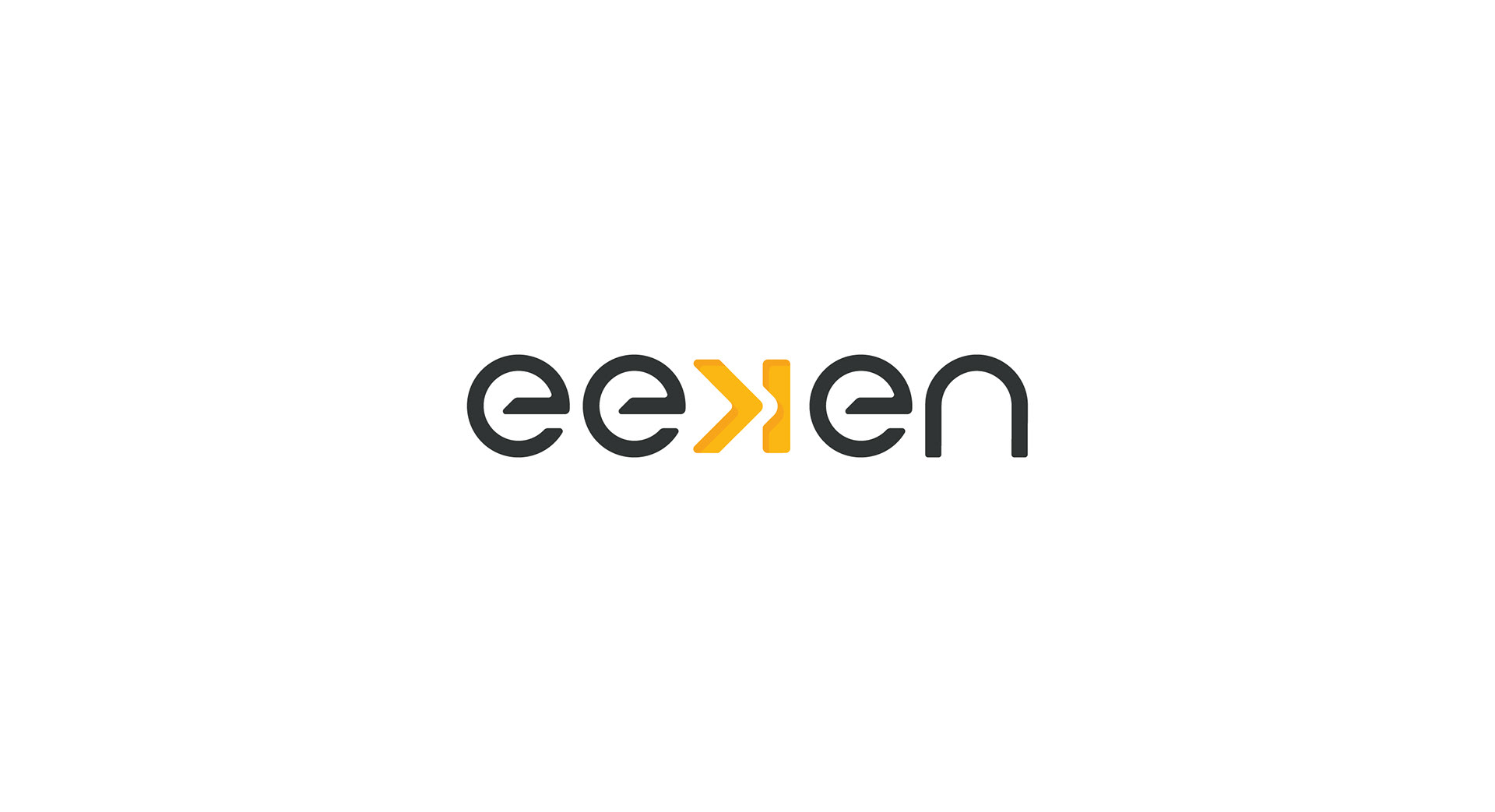
The logo is meant to represent the idea of breaking the norm and thereby chartering a path that is new and innovative much like the generation for who it is designed for. It is constructed from a custom-designed typeface built essentially by the basic shapes of the circle. The ‘K’ in the workdmark Eeken is in reverse and stands apart from the rest of the wordmark.

Disclaimer: These creatives/designs/concepts are the intellectual property of the respective client and/or agency.
I do not personally own them.
I do not personally own them.