
Ekart Rebranding
Client: Flipkart
Agency: Owlworx (Consultant)
Year: 2022
Agency: Owlworx (Consultant)
Year: 2022
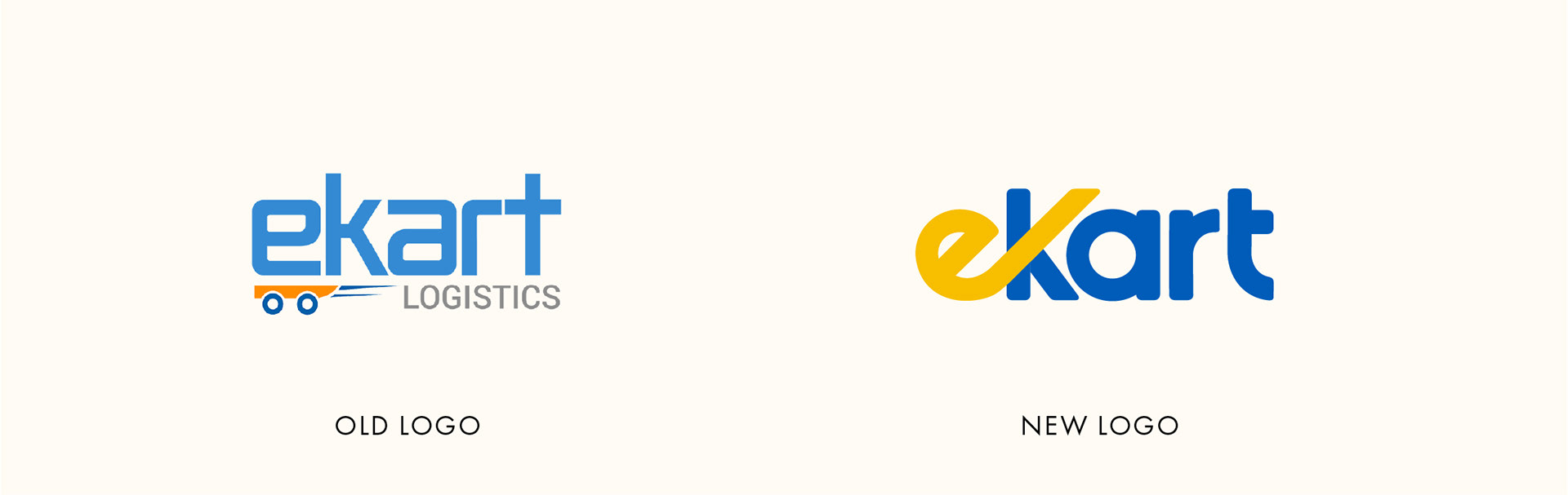
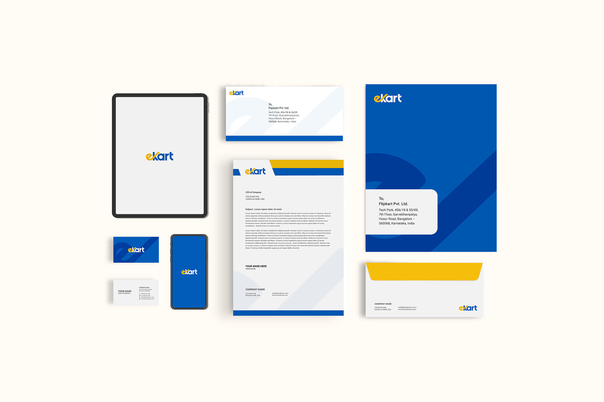
Ekart, the prominent logistics and supply chain company operating under the Flipkart umbrella, embarked on a brand revamp initiative to establish a more contemporary image. Their objective was to create a logo and brand architecture that would embody their crucial role as an active enabler within India's bustling digital commerce ecosystem. The newly designed logo reflects the core values of simplicity and assurance, presenting Ekart with a fresh and modern avatar while instantly evoking a connection to the trusted Flipkart brand. This transformation not only enhances Ekart's visual identity but also positions them as a reliable partner in delivering seamless logistics services.
Logo conceptualization
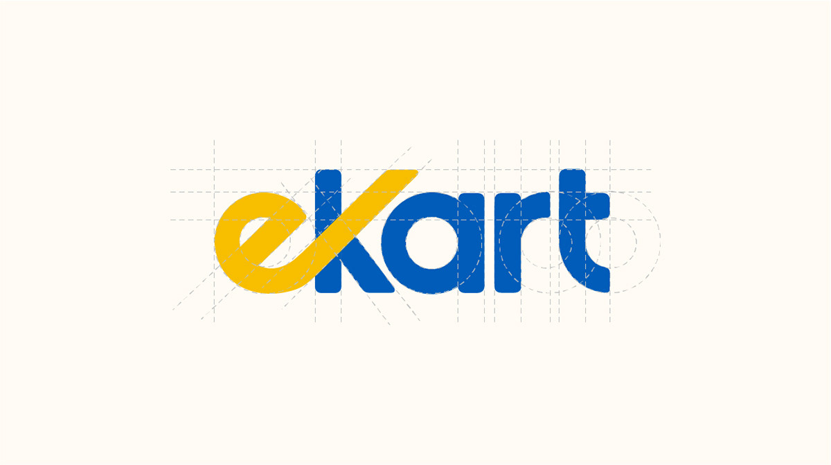
The Ekart logo features a vibrant yellow 'e' that forms the foundation of the design. The upward curve of the 'e' symbolizes growth, reminiscent of an ascending graph. This curve seamlessly extends to become the upper arm of the letter 'k' in the word 'kart,' which is presented in a contrasting shade of blue.
Disclaimer: These creatives/designs/concepts are the intellectual property of the respective client and/or agency.
I do not personally own them.
I do not personally own them.